COLOR PERSONALITIES & HOW TO CHOOSE YOURS
What’s your favorite color? Everyone has one. A color that speaks to you, a color you naturally gravitate towards, excites you or soothes you, perhaps. Colors influence perceptions. They can cause certain emotions. So when it comes to branding your business, choosing your logo color is a big decision. The color of your logo can affect the perceptions about your goods and services before possible customers/clients even know what you’re selling! *Studies have shown that customers make a judgment on people or a product within 90 seconds, and 62-90% of their judgement is due to color alone.
The pressure! Of a color!!!
Don’t stress, we’ve got you!
How do you choose the right color for your business logo that will produce positive vibes from possible clients?
Welcome to Color Psychology 101!
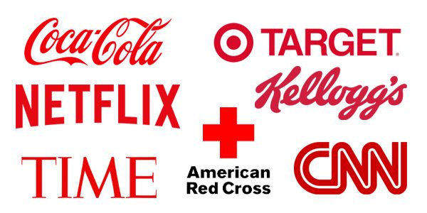
RED
Not surprisingly, red as seen as strong, ambitious, competitive, bold, passionate, determined, confident, and memorable. Look at these logos and you can probably match up a few of these emotions when you look at them: CocaCola, Target, Red Cross, Netflix, CNN, TIME, Kelloggs.
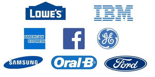
BLUE
Fun Fact! Ask people what their favorite color is and half will say blue. Half! Understandable, because blue is perceived as peaceful, truthful, soothing, stable, loyal, honest. Which is why you see businesses like Lowe’s, Ford, Facebook, GE, American Express, IBM, Oral-B, Samsung all sporting a blue logo.
GREEN
Ah green – the safe, secure, accepting, down to earth, frank and aware of others color. You see green you think nature, life, clean, crisp – just what brands like Whole Foods, John Deere, Starbucks, BP, and Animal Planet want you to feel when you see their logos.

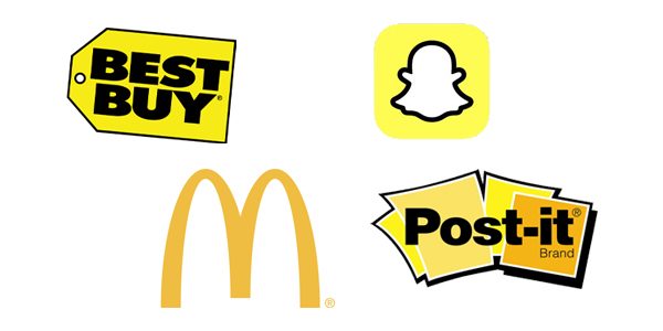
YELLOW
Quick! What’s the first thing that comes to mind when you see yellow? Perhaps happiness, sunshine, brightness, individuality, warmth, cleanliness, and positivity. Yellow is bold yet simple. Think McDonald’s – those golden arches! Post-it – can’t miss a yellow post-it! Best Buy with their big yellow ticket! And Snapchat, the latest in using yellow to speak to their fun, young brand!
ORANGE
Orange is for the social butterflies, a lively and friendly color (this is my sister’s favorite color and it makes so much sense to me now). Mastercard, Home Depot, Nickelodeon, Fanta, Crush, Harley Davidson all chose orange as their logo color and you can see why – they are social, lively, friendly! Orange = energy! Look at Gatorade’s orange lightning bolt! We want energy and Gatorade is going to give it to us! Sold!
BROWN
Brown, it’s stable, simple, dependable, earthy, rugged, friendly and traditional. The obvious choice for brands like Hershey’s, M&Ms, Nespresso – I mean come on, brown is the color of chocolate and coffee! No brainer! But think about it… UPS – dependable, Cotton – earthy, A&W – friendly, Louis Vuitton – traditional.
PURPLE
Purple (my personal favorite) conveys artistry, uniqueness, intuitiveness, being active, elegance, wealth, luxury, compassion and maybe a little arrogance (well, no wonder I like purple! 
PINK
Pink is the loving, kind, soft, sensitive, nurturing, sensual, sweet, charming delicate, and innocent color of the bunch. It screams feminine. It’s no wonder Barbie, Victoria’s Secret, and Cosmopolitan all chose pink. But look at LG and TMobile. Pink wouldn’t have been the first color I would have picked for them, but you know what? Those are all positive attributes and the best part is IT STANDS OUT! LG & TMobile aren’t dummies.
BLACK
Black is sleek and sophisticated, classic, powerful, prestigious, not afraid of anything, demanding, timeless, luxurious and bold. All these words describe what each of these brands – Prada, Gucci, Adidas, Sony, Chanel, Nike – represent. I’d say they succeeded in their color choice.
WHITE
White is simple, open, pure, confident, positive, logical, innocent, independent, detail-oriented, organized and clean. L’OREAL, OLAY, APPLE, PBS – makes sense to me!
Ok, we’ve covered what each color can be bring to the table… but how do you choose YOUR logo color?
Picking your logo color goes hand-in-hand with deciding what is your company brand message. Start by asking yourself some questions:
- What is your business? What does it do? What is the goal? Is it down to earth, rugged, construction? Then you might want to consider a brown or green or a combination of both. Is your company supplying a need for children? Consider blue, yellow, orange or pink! Are you a spa? I’d definitely pick a blue over yellow. Yellow is a nice, happy color, but when people think of a spa experience, they want to feel calm and soothed, two words that fall under Blue’s description!
- How do you want people to feel when they see your logo? Remember you have 90 seconds to make an impression. What is that impression going to be? Strong, kind, outgoing, honest, clean, unique, active, fun, sophisticated?
- Consider your competition. What colors are they using? Now ask yourself – should your company stay within those same color schemes because they really speak to your clientele? Or can you buck the trend and find another color that still speaks to your brand but makes you STAND OUT in the industry (like the LG and TMobiles of the world)?
Remember, colors can be perceived in different ways by different people. So you might want to experiment with a couple of options and get feedback from different people such as current customers, potential customers, friends, family, and most importantly, A DESIGNER! Working with a professional is the best way to explore your options and think of how color can work within not just your logo, but your entire marketing strategy!
*Reference: https://www.emerald.com/insight/content/doi/10.1108/00251740610673332/full/html

 MEET JENNA MANZANO
 MEET JENNY LIPINSKI
 MEET MADDIE CARR
 MEET ISABELLA PARISE
 MEET ALLISON BOROSKI
 MEET UTAH
 MEET CHRISTIANA HARRIS
 MEET JENNIFER GDULA
 MEET JOHN SOPCHYK
 MEET JULIANNA KLECKA
 MEET RICK GIBSON
 MEET JULIE HRDLICKA

