The world is full of TRENDS. Fashion, music, finance, interior design (shiplap anyone?), political topics – we can’t get away from them. Even Pantone releases a Color of the Year.
Trends can be fun! They are NEW, exciting, fresh! What other synonyms can I use for ‘new’? Using trends in a logo can make your logo pop – really catch the eye of customers. While it’s fun to update and refresh your logo, trends come and go, you don’t want your logo to become outdated in a couple of years. You want your logo to be unique, speak to your brand and, like a fine wine, age well.
A logo should also be distinctive. You want it to be bold so customers can quickly recognize you by just an icon or color. Following common trends can make you just another face in the crowd.
Basically, good logos should have a long-lasting appeal that WORKS. Stay away from these common design tips that are bound to make your logo less than stellar.
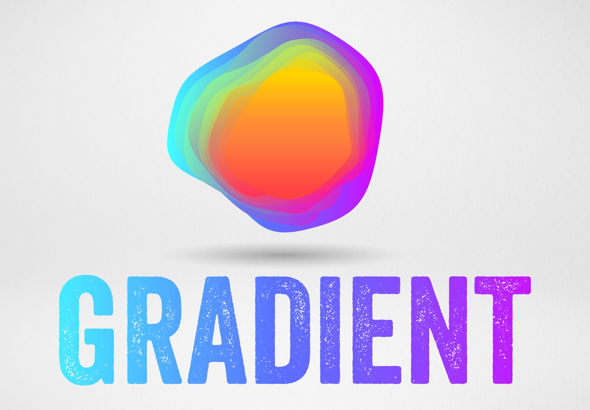
Gradients
Gradients can look nice and create some definition, but keep in mind your logo needs to look good in solid colors as well. When the logo is all black or all white, is it still YOUR LOGO or does it give it a whole new look? Also, keep in mind that gradients will make it hard to embroider or print your logo.
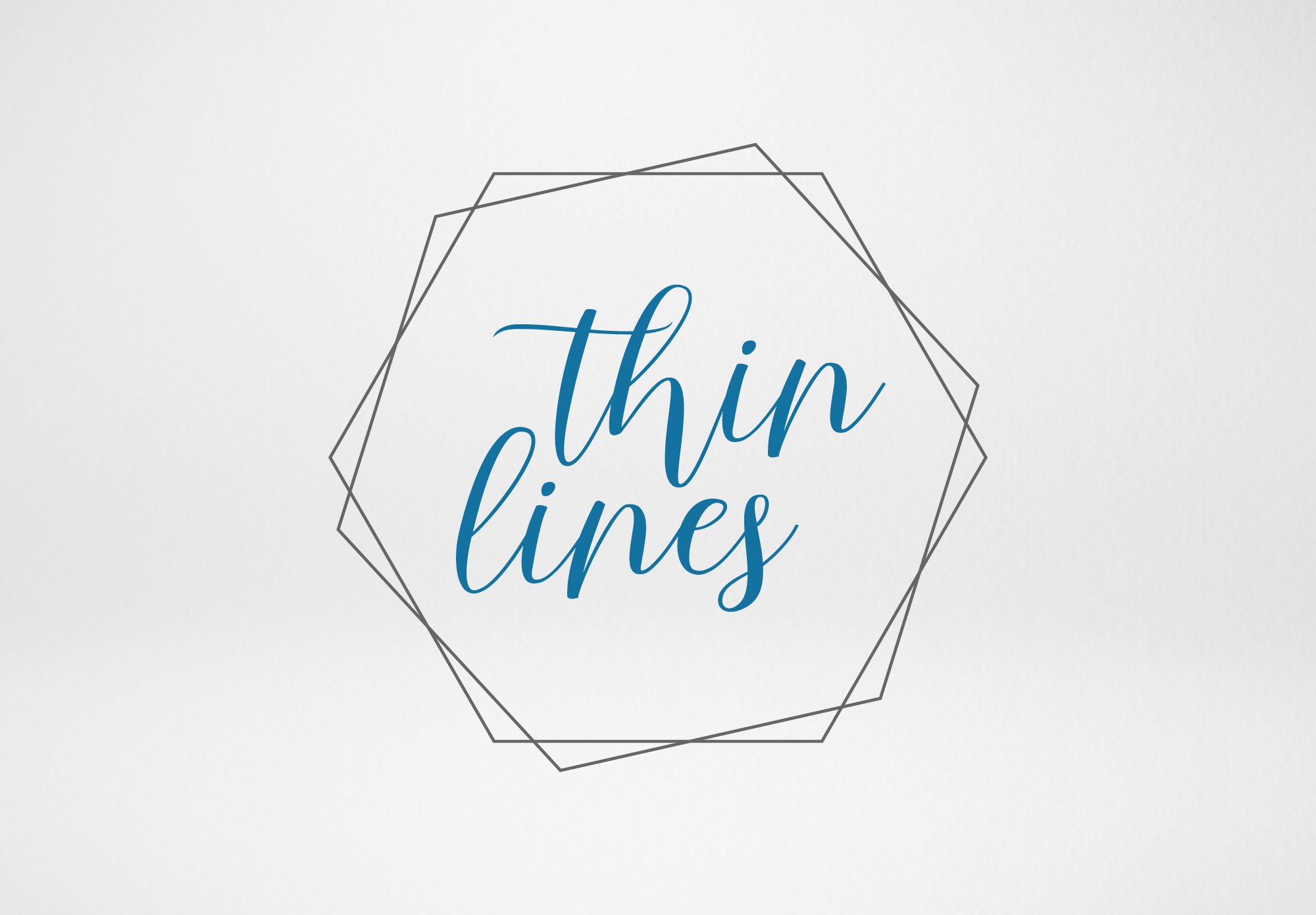
Thin Lines
Gradients can look nice and create some definition, but keep in mind your logo needs to look good in solid colors as well. When the logo is all black or all white, is it still YOUR LOGO or does it give it a whole new look? Also, keep in mind that gradients will make it hard to embroider or print your logo.
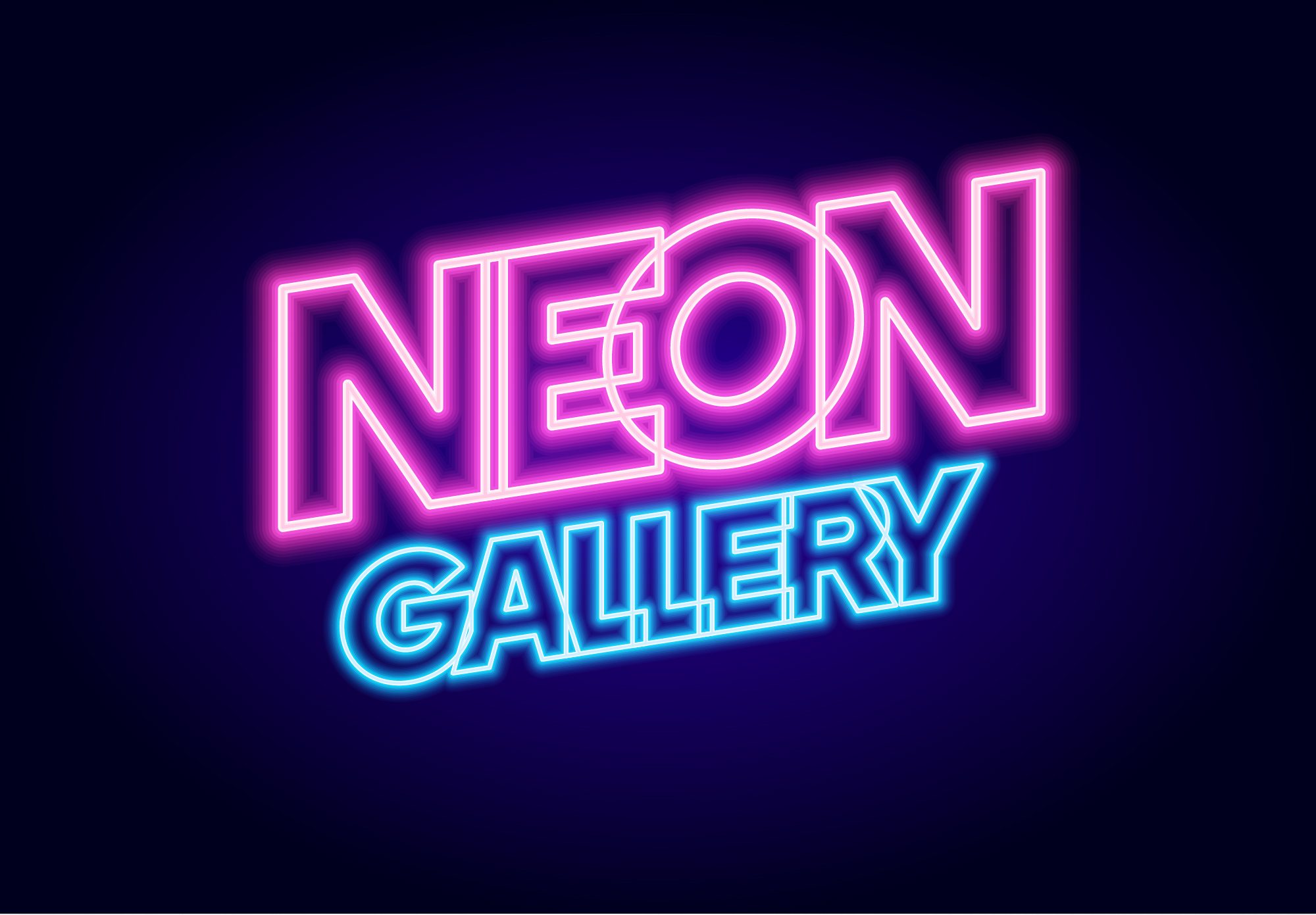
Neon
The 80s are back! You may have noticed fashion styles coming around again. Do skinny stonewash jeans, fanny packs, scrunchies, or oversized square/rounded glasses ring a bell? So as old as this might make some of us feel, the 80s are now retro and cool. While the 80s neon look can provide a sense of nostalgia, keep in mind that by the mid 90s, it was old and outdated. You do not want a logo that needs a redesign every decade.
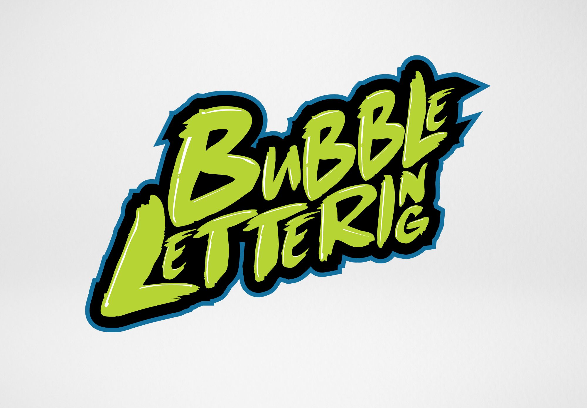
Bubble Lettering Typography
Bubble lettering is another graphic design trend that designers are using. Bubble type may be a good way to capture attention and create a statement, but will likely look silly or unsophisticated once this trend fades. A logo using bubble lettering likely won’t stand the test of time as your business grows.
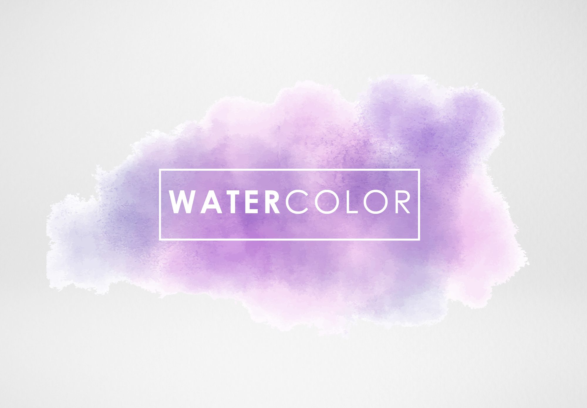
Watercolors
Watercolors are beautiful! They can present a peaceful, serene look – perfect for a spa, environmental organization, or an upscale restaurant. It may look really nice, but using any kind of pixel based imagery (for example, a photo) in a logo is taboo. Vector artwork is a necessity for logos to ensure scalability and crisp lines.

 MEET JENNA MANZANO
 MEET JENNY LIPINSKI
 MEET MADDIE CARR
 MEET ISABELLA PARISE
 MEET ALLISON BOROSKI
 MEET UTAH
 MEET CHRISTIANA HARRIS
 MEET JENNIFER GDULA
 MEET JOHN SOPCHYK
 MEET JULIANNA KLECKA
 MEET RICK GIBSON
 MEET JULIE HRDLICKA